The Psychology of Web Design
Published on
October 18, 2016
By Don
Studio Designer
Or “How to Get in Their Heads”

Whether I’m shopping for a new table tennis paddle or a new car, or maybe I’m just trying to learn something new, when I pull up a website, I want it to be a fun, meaningful experience. I want to feel good about my site choice, and I want to feel like I’ve chosen exactly the right site to fulfill my every need.
How does this website make me feel? As soon as it comes up, just by the look and feel of the site, do I feel I’ve come to the right place? What does this site offer that makes me want to stay or, more importantly, keep me coming back? Has this site somehow managed to “get in my head”?
A lot of questions, I know, but by looking at a few simple theories, I think we can answer most, if not all, of them.
It seems to boil down to a few basic principles: content, space, color and typography.
Content
This is what gets you to a site and what should keep you coming back. How is this best done? A designer has to take into account what makes the user happiest. A designer must do their research and really find out what makes this client tick. How the designer gets the user to their happy place is of vital importance.
Webpages used to be full of content and took up as much space as they could. Trying to navigate through a sea of type and buttons and clicking from one page to another became quite overwhelming for most. This did not put the user in a happy place. Indeed, quite the opposite. The emotions generated through that experience were more like stress, anxiety and maybe a touch of anger. Not good.
Today’s sites have to be much more organized and streamlined. The user has to be able to find what they want, and move through the site as easily and quickly as possible. The feelings we generate through these methods are more like happy, joyful and even elated. Very good.
If you take the time to think about what your visitors want and how they want to get it, then you’re already on the right track to creating a site that will tap into the psychological drives of your target audience.
Color
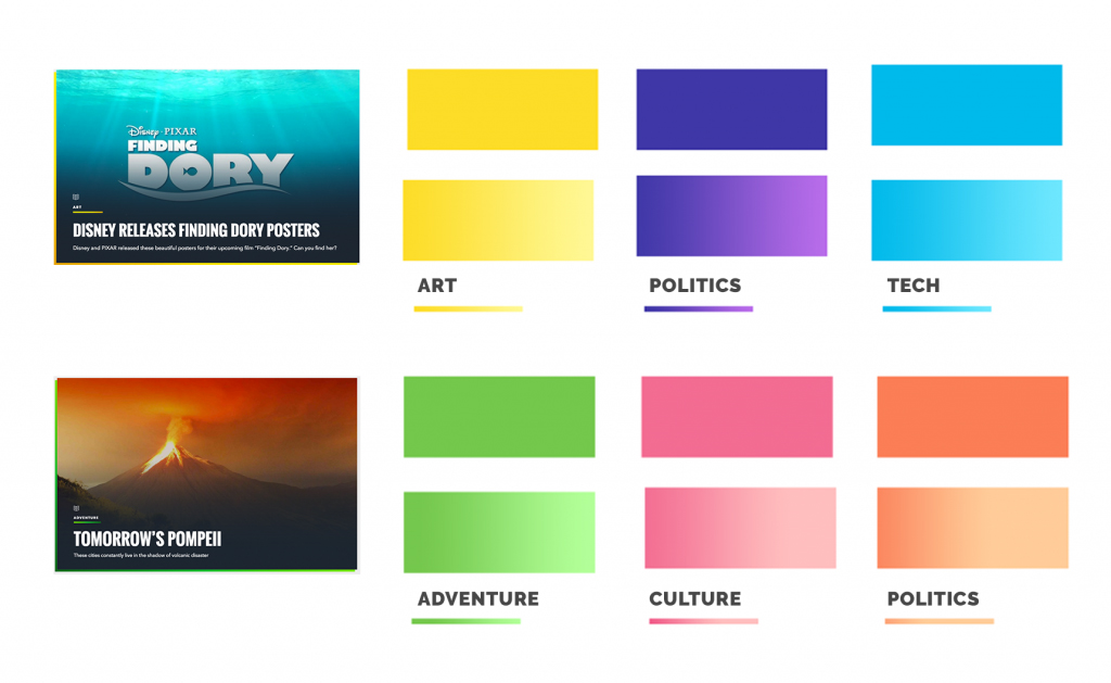
Ready to talk a little bit about color? Here we go. Color and the many moods it can create is a big player in the design process. Color can really mess with your head. It can dictate your mood and take you in many different directions. For a lot of sites, color is often dictated by the organization’s branding.
The way we use those colors, though, can have a long and lasting effect on what we think of the site, hopefully in a good way. Cooler colors (blues, greens, purples) can be calming and relaxing while still giving us that professional feel. However, they can also be cold and portray an unfriendly feeling as well. Warmer colors (yellows, oranges, reds) can give us positive energy and hopefulness.
So let’s try and stay positive, folks; it just makes for a better day.

More on Color
Below is a basic list of colors and their meanings. Of course, the combinations of colors you use along with their exact shade, hue or tone will also have an impact on their meaning.
Red
Fiery and passionate. It can represent both love and anger.
Orange
Shares attributes of both red and yellow. Associated with energy and warmth. It’s calmer than red and more cheerful.
Yellow
A warm, happy color. It can represent either joy or cowardice.
Green
Signifies nature, growth and renewal. Along the same lines, green can sometimes represent inexperience. On the flip side, green is sometimes associated with envy or jealousy.
Blue
Calming and cool, but too much can be depressing. Often associated with corporate images.
Purple/Violet
Long associated with royalty and wealth. It’s also a spiritual color and is thought to be creative.
Black
A bit of a chameleon, it can be conservative or edgy, traditional or modern. It can be mysterious and sexy or conventional and safe, depending on how it’s used.
White
Associated with purity and innocence. It goes well with any other color.
Gray
Neutral and balanced. Gray is conservative and sophisticated, but can be seen as moody, too.
Brown
A wholesome and down-to-earth color that denotes stability and reliability.
Space
While keeping our content organized and in an easy-to-get-to position, we still have to consider how much actual space we’re using.
You don’t want your visitors to feel overwhelmed and claustrophobic. A page with absolutely no space left will most likely feel chaotic and overwhelming. Taking up every inch of real estate on the page will have the user unable to focus on why they came to the site in the first place.
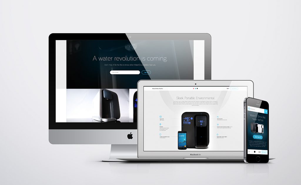
I’m talking about white space, people, glorious white space. Let your design layout breathe. Give the users’ eyes a chance to rest (because that’s what white space does). They’ll really appreciate it. It also creates an atmosphere of professionalism and creates an overall good vibe.
A couple of great website examples would be apple.com and tesla.com. Great use of white space while still providing great content and great navigation tools. Ultra-professional and friendly at the same time. Keep it simple, keep it clean, keep it real.

Typography
Font choices matter. They do. I wouldn’t kid about this. I have a great affinity for type and for the right font to fit the right situation. Many, many fonts are available these days for web use. This was not always true. Early on, the designer had very few fonts to choose from and would feel somewhat limited. Of course, this caused a bit of stress in itself.
Type can speak volumes about your company and your services. And, again, spacing is a key player in your presentation. Type should be easy to read, easy to navigate and pleasing to the eye.
Size, space, position and color all matter.
Serif fonts, those with little serifs, or feet, on the letters (such as Times New Roman), are often associated with professionalism, scholarliness and seriousness, while sans serif fonts (such as Helvetica) are a bit more modern feeling, cleaner and more informal.
In Conclusion
So you figured out a way to “get in their head” by making good design choices and making tried-and-true decisions on how to apply them. This enhanced your content while managing to keep everything organized and on point.
The psychology applied with this method is very effective and can serve the designer well in not only web design, but print as well.
Pat yourself on the back now that you’re able to design with these things in mind, and keep striving to not only “get in their head” but to “stay in their head.”