Describing Color in an Accessible World
Published on
November 01, 2018
By Gary
Production Manager
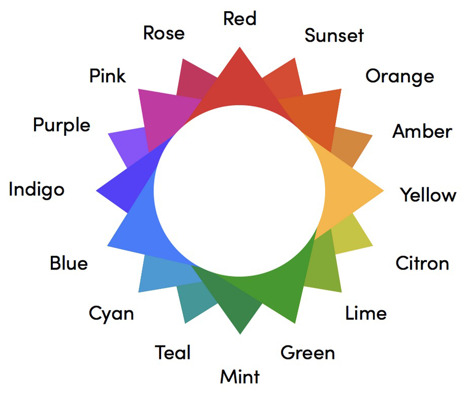
The Uber-competitor Lyft is more than just an alternative ride-share service. Turns out, it’s pretty conscientious as well. In working on the company’s branding, the design team at Lyft decided to do something radical. Rather than using traditional paradigms to describe color, they created their own, one that took accessibility issues into account at the outset.
The result is a color “language” that solves a ton of problems across the digital landscape.
TL;DR
Lyft is driving an accessible new language for color using a hip 3D imagination and old-fashioned math.
Resources
Re-approaching Color
Lyft